Intro
I recently changed the OddPrints logo on the website from an image to simple text styled with CSS and @font-face. To me it seems like the obvious thing to do but very few websites seem to employ the technique. I thought I’d explain my thoughts and I’d love to hear what you think…
1 – Sharper
This is the main reason. I recently bought a Retina MacBook Pro and the screen quality is amazing. I like to think I’m an optimist and I would normally just be happy with the obvious upgrade. The reality is that I mainly notice the apps and graphics that are not “retina ready” and just look soft and fuzzy. This in turn makes me feel dirty that I have to interact with something so dated and stupid. Here is an exaggerated example of what my logo looked like when zoomed in.
For a programming geek, I am relatively late to stumping up the cash to join The Retina Revolution. Until now, I was blissfully unaware that work needed to be done to make your site shine on such a device. If you don’t own a retina device, pop in your local fruit shop, grab a retina macbook pro and browse a few websites. It won’t take you long to find a website that has a logo or icons that look noticibly fuzzy next to that the razor-sharp text in the body. I hope it’s not your site. People much smarter than me agree that you should make sure your logo and icons look good on such a display. The recent launch of the Chromebook Pixel should be further evidence that we’re on the brink of a future with more pixels.
2 – SEO
This should be obvious but images aren’t as simple as text when it comes to being indexed by Google. Keeping things as plain html markup means I don’t have to worry about sensible alt attributes or whatever. You can still cut-and-paste the text which is handy sometimes (but not so handy that it deserves its own section, jeez). This isn’t a big reason, more a bonus feature.
3 – Internationalisation
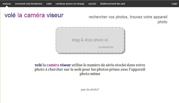
If you happen to write an awesome website that is used by people around the world, they probably want to read it in their language. I can’t be bothered to internationalise my sites when Google translate does such a good job. I recently saw a French blog post and this screenshot made me look twice:
Now, of course this could be seen as a bad thing if your logo is poorly translated or your branding is so important that you need full control of the exact appearance. As I’m writing this, the more I’m going off this point. It not like my url changes so why should my logo… thoughts please!
4 – Accessibility
Cons
Legacy browser support is sketchy. Initial page load may be slower if using javascript or the font files are big. You may experience a flash of un-styled text in some browsers. These problems can all be reduced with crazy tweeks like only including the characters you need in the font file, or base64 encoding them in the css. Tools such as fontsquirrel, Google’s web fonts (and loader) solve most things, but even that takes a little reading just to get your head around. This all boils down to the same con: It’s hard to get right. Of course, if you’re already using web fonts elsewhere on your site, you’ve already solved these problems 😉
Alternatives
If you still want to serve images, and I’m not putting forward a fantastic argument why you shouldn’t, I strongly recommend serving higher-resolution alternatives to displays that need them. It’s pretty simple to do with libraries such as retina.js. For example, when on my laptop, microsoft.com serves me a nice high resolution version of their logo. Fail to do this and your site just lost 5 subconscious quality points in your customer’s noggin.
You could also just upload your logo as a vector image. Similar problems with browser support but certainly a valid option.
Conclusion
Designing your logo as a simple font that can be rendered in a browser isn’t for everyone. Big companies pay designers to draw clever graphics that need more than just a font file, and many websites care more about appearing the same on as many devices and browsers as possible. If however you just want something that looks great on most platforms but you care more about impressing those visitors on modern, expensive devices, maybe a font-face/css/svg logo is for you.

